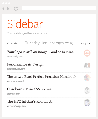
Have you seen the new Kickoff site yet? Kickoff is a collaboration and group chat app for Mac OS, and they recently launched their v2.0, along with a gorgeous new site.
Go ahead and take a look. The site is a perfect example of what you could call the “Apple-style” school of web design: white background, plenty of whitespace, crisp icons, and Myriad Pro.

Kickoffapp.com vs Apple.com
The site has clearly been designed to trigger a strong association with Apple in the visitor’s mind, and communicate the fact that this is a Mac app with the same level of design polish as Apple’s own apps.
But this admiration for Benjamin De Cock’s amazing ability to out-Apple Apple made me reflect on my own feelings about imitation in general.
Why do I feel like imitation was something to applaud in this case, yet in other instances my instinct is instead to shame and condemn it?
LayerVault vs Flat UI
Specifically, the other case I have in my mind is the Flat UI vs LayerVault battle that took place last week.
It all started when DesignModo released a UI kit that offered some striking similarities with LayerVault‘s overall aesthetic.
Flat UI vs LayerVault
(Now to get one thing out of the way, LayerVault’s problem with the UI kit was not with its general style, but with the fact that the kit allegedly copied specific icons from their site.)
However I’m not interested in discussing all that. What I’m interested in is my own reaction: when I saw Flat UI, I immediately felt indignant that someone would rip off LayerVault so blatantly.
Drawing The Line
Yet thinking about it, I can’t really find any justification. After all, if Kickoff’s case is ok yet LayerVault’s is not, where do we draw the line?
What if DesignModo released an Apple-inspired UI? Or if the Kickoff site had copied LayerVault? Somehow the first option feels ok, yet the second doesn’t. But why?
And where does something like WP-Svbtle fit in? It’s a literal rip-off of Svbtle’s design, yet its author doesn’t seem to feel ashamed of it in the least, going so far as to name his theme after the site it’s copying.

No need for comparison, Svbtle is exactly the same.
Clearly WP-Svtble is the worse form of plagiarism, but where would it start being ok? If you changed the name? Changed the font? Changed the background color? It’s the Ship of Theseus paradox applied to design…
It’s All Pointless
What I’m driving at is that this whole debate is pointless. Even though our gut thinks it knows right away what’s right or wrong, coming up with concrete arguments to back up your position can prove much harder.
The deeper you dig, the less it makes sense. For example, why should writing a song earn you royalties, yet creating a logo doesn’t? On the other hand, why can you copyright a logo, but not a typeface? Unless that typeface appears itself in a logo, of course.
All this to say that unless you want to waste hours arguing on Twitter, (or become a copyright lawyer), I suggest you do what I intend to do from now on: stop caring.
Want to use the same red as I do? Fine.
Want to copy this blog’s layout? Why not.
Want to use my “SG” logo? I’ll be pissed off, but go ahead. I have no legal or moral basis to keep you from doing it, and there’s not much I can do about it anyway.
Marc Edwards said it best on Twitter:
Time you spend being angry is time you could have used in a happy, productive way.


Pingback: Flat design in motion graphics - Motion Mojo