
Note: this article was originally sent out in my newsletter. Sign up now to receive design tips like this once a week, and in addition you’ll also receive my Color Theory for Startups eBook for free!
My friend/nemesis Jarrod Drysdale recently released the landing page for his new project, Cascade.
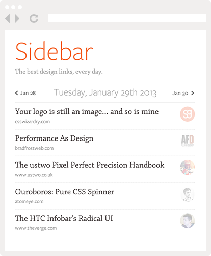
Now I didn’t have any inside information about Cascade. The first I ever heard about it was when I saw that page, and it did a pretty good job of making me curious about the project.
So I thought it’d be interesting to take a look at that page more in detail to see why it’s so successful (you’re gonna want to enable images for that one).
First of all, go take a look at the page yourself to form your own opinion. I’ll wait.
Back? OK, so let’s scroll down the page together.

The page’s main tagline is set in huge 80px font, and announces that “your startup design struggle is over“.
This doesn’t tell us anything about what Cascade is, but it does contain two very important keywords: “startup” and “design”. Both words are very familiar and — for lack of a better word — trendy, and help establish the product’s target audience right away.
Moving on to the second part of the screen, we see Jarrod did something very smart: he’s using a chalk brush style to depict the various UI elements you can generate with Cascade.
Digital design usually features straight lines and perfect shapes, so employing imperfect lines and analog textures like this is a great way to make something stand out. In fact, Jarrod already used this technique for his book’s landing page by peppering the page with small handwritten annotations.

We then reach the big call to action zone. Two things to notice here.
First, the triangle shape is drawing our eye down and encouraging us to focus on the form field. Second, that field and button are the only green elements of the whole page.
It’s true that this shade of green clashes with the page’s dominant orange, but on the other hand that clash ensures these elements stand out even more.
That tagline is also interesting because it’s phrased as a question. Questions are well known to attract attention more than normal sentences, maybe because in real life, a question usually calls for a reaction on our part.

The rest of the page follows a simple pattern: big headlines addressing the user directly, and a narrative that tries to anticipate the user’s mindset.

Again: big headline, address the user, put yourself in their place, and use big downward triangles to keep the user scrolling. Notice too how the section breaks off just after the colon (“:”), making it virtually impossible for the reader to stop there.

Jarred stays on message here, by reminding the user of their predicament (being “stuck on the design”). Did you notice how big the font size was throughout the whole page? Body copy is never smaller than 18px, making the page much easier to read than the traditional 12-14px.

Finally, the subscribe form is repeated at the end of the page to avoid forcing users to scroll all the way back up. Never underestimate the average internet user’s laziness!
Show vs Tell
Of course, I don’t actually know if this landing page converts well or not. After all, sometimes showing is more effective than telling.

A completely different style of landing page
The Pencil Case landing page is a good example of this: it barely tells you anything about the product, but by showing an appealing screenshot of the app it still manages to make you curious enough to leave your email.
(Note: I’m willing to bet that same landing page without the rainbow color scheme would perform far worse!)
Taking It Too Far
As a counter-example, I think ConvertKit‘s homepage takes the “tell” strategy too far: the copy is great, but there’s no screenshot, mockup, or wireframe of the app… in fact, the page doesn’t even feature the app’s name!

ConverKit: too much telling, not enough showing
The Meteor Book
I actually think the perfect landing page would be a mix of both approaches. After all, even if you write the best copy in the world, people still want to see something of your app.
And it’s never too early to establish your app’s brand, whether that’s a color, a font, or a silly mascot.
At least, that’s what I tried to do when I designed the landing page for my latest project, The Meteor Book:

Landing page for The Meteor Book
Screenshots of a book wouldn’t be too interesting, so I mocked up a quick illustration to give the product some substance. I also tried to establish brand colors with a distinctive purple/yellow combo (as well as the 8-bit banding effect on the gradient).
And to give people a reason to actually come to the site in the first place, the page also features a blog with a couple helpful articles.
Conclusion
Now none of these landing pages will win any design prizes. But this is precisely why I chose them: they show that by using good copy and simple design elements, you can design effective landing pages without being a Dribbble superstar.
But above all, remember the first Law of Landing Pages: an imperfect landing page is better than no landing page at all!
As usual, you can discuss/upvote this article over at Hacker News.
Pingback: Creating a Landing Page the Right Way | Scarsongs
Pingback: Veille #69 | Le Blog – julienvennin.com
Pingback: Design
Pingback: Новости » Blog Archive » Дайджест интересных новостей и материалов из мира айти за последнюю неделю №45 (16 — 21 февраля 2013)
Pingback: Your App Page Blog | PAKAR KITA
Pingback: Put the logo below the fold: Breaking design rules for profit. | Studio Fellow Blog
Pingback: Why Write // Articles // Studio Fellow