
I was originally planning to simply update my previous article with a couple new fonts, but to Google’s credit I came up with so many additions that I decided to simply write a new post.
And this time, I tried to include real-world visual examples whenever I could, since evaluating fonts over at Google Web Fonts can be less than optimal (to put it kindly).
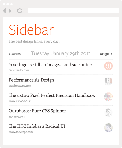
(Quick plug: my new project Sidebar gives you the 5 best design links of the day. You should go check it out!)
(Note: some of those fonts were already in the previous article since I kept updating it for some time, but I’m putting them here as well in case you missed the updates)
(Note 2: a huge thank you to Ali who suggested a lot of these fonts and helped me with this article. Go follow him on Twitter now if you want to learn about typography!)
The User Interface
First, let’s get one thing out of the way: Google Web Fonts’ user interface is still as bad as ever. It’s visually ugly, clumsy to use, and it doesn’t even match Google’s new style as seen in Gmail or Reader.
(Also, Google Web Fonts’ front-end code is a pretty strange mess of absolutely positioned divs with inline CSS styles. But that’s best left for another article).
Its worse offense is without a doubt how it manages to make even the nicest typeface look hopelessly crowded and unreadable thanks to poor typographic choices. Just take a look!

Google proves us that even Adobe’s Source Sans can be made to look bad
Now contrast this with Jesse Dodd’s personal site, which uses the same typeface except with sane typography:

Ahh, much better!
This means Google Web Font’s own user interface is pretty much useless to actually select fonts. Thankfully, there are a couple simple alternatives.
The first one is simply Google Docs. Did you know you can use most Google Webfonts in it? Simply go to the font menu and click “add fonts” at the bottom. You’ll get this dialog:

Why can’t Google Web Fonts look like that, too?
Not only does Google Docs apply sensible typographic settings by default, but since you’re in a text editor you’re free to change them yourself!
On top of that I’ve found that actually writing with a font is a great way to evaluate its readability.
And another great tool is FontFriend, a neat bookmarklet that lets you apply any Google Webfont to the current page (thanks to Ali for reminding me of it!).
But I know that you came here for the fonts, so without further ado here are my new favorites:
Open Sans
There’s surprisingly few good sans-serif typefaces usable on the web. At the dawn of time, people used Verdana, which was replaced by Arial, which was itself replaced by Helvetica (in large part thanks to being the default font in iOS as well as Twitter Bootstrap).
But since then, we’ve kinda reached a stalemate. Proxima Nova is vastly popular, but it’s not free, putting it out of reach of cheapskates everywhere.

Open Sans in use on the Folyo blog
Enter Open Sans, which is quickly becoming a very popular typeface. I’m not a type expert so I won’t bore you with discussions of counters, x-height, or x-wings. Suffice to say it’s a great-looking font!
Source Sans
Source Sans was just released by Adobe last week, but it’s already on Google Web Fonts. And I can very well see it challenging Open Sans for the crown of being the web’s favorite new sans serif.
PT Sans

PT Sans in use on the StrongSpace site
PT Sans is a great (if a little serious-looking) font perfect for corporate sites. It’s also available in Caption and Narrow variants, and even has a Serif companion!
Droid Sans

Droid Sans used by Rob Turlinckx on Dribbble
Droid Sans was designed by Steve Matteson (who also designed Open Sans).
Lato

Lato used by Grayden Poper on Dribbble
Lato is noteworthy for its collection of thin weights. Thin fonts look great at large sizes, especially on a dark or colored background. (but don’t try using them for body copy!)
Cabin
I don’t know if Cabin is Pablo Impallari’s attempt to make up for unleashing Lobster on the world, but in any case it’s a nice sans-serif that also comes with condensed and sketch versions.
Gudea

Gudea used by Mathieu Strabach on Dribbble
Gudea is a technological-looking sans, with a strong bold weight perfect for taglines or even logos.
Droid Serif
Droid Serif is the serif companion to Droid Sans, and also a very good choice.
Lora
Lora is a very nice serif font that’s perfect for body copy.
Poly
Poly is a good alternative to Lora.
Alegreya

Alegreya in use on Ben MacGowan’s site
Alegreya stands out by offering not only bold, but also ultra-bold, making it a good font for both body copy and headings.
Noticia Text
Noticia Text is yet another good serif option.
Rokkitt

Dave Ruiz’s gorgeous Avid theme uses Rokkitt for captions
Rokkitt is a stylish slab serif with a strong personality.
Glegoo
Glegoo (who comes up with these names?!) is another good slab serif with a tall x-height that gives it a slightly industrial look reminiscent of Kulturista.
Pacifico
Pacifico maybe be in danger of becoming the next Lobster (although personally I think that title belongs to Wisdom Script), but for now it’s still a very nice typeface.
In fact, I used it myself on personal projects like my eBook and The Toolbox.

Pacifico being used for image captions (in red)
Updated on August 20: a couple more nice ones.
Asap

Asap in use in the ReelSurfer nav bar
Asap is a sans-serif with a lot of character, and is especially nice in its italic variant.
Amaranth

Amaranth in use in the Duet theme’s headings
Amaranth is a slightly quirky (but still lovely) sans-serif.
Armata

Armata in use on the Nodize site
Armata is a technical-looking sans-serif which reminds me a bit of Stratum.
Cutive

Cutive in use on iStockSlogan
Cutive is a cute typewriter font reminiscent of American Typewriter.
Updated on September 13
Abel

Great use of Abel by the talended Claudiu Cioba
Abel is a narrow sans perfect for giving a bit of personality to headings.
Dosis

Patrick Haney putting Dosis to good use
Dosis is another Pablo Impallari creation. It’s a round and narrow sans that comes in no less than 7 weights.
Varela
Varela is a great alternative to Proxima Nova, and like its more famous cousin it also comes with a Rounded version. It’s used beautifully on the Threadlife site.
Imprima
Imprima is a nice font reminiscent of Bree which you can see in use on Ronan Berder’s blog.
Ropa Sans
Ropa Sans is a technological-looking sans that works well for headings.
Playfair Display
Playfair Display is a gorgeous serif that pairs well with Lato, as seen in The Rise of the Artist.
There’s no denying that Google Web Fonts has become a tremendous resource for web design. There’s no reason anymore to use boring old Georgia (sorry, Georgia! I still love you!) or Arial anymore. Now if only they could just fix their awful site…
Anyway, I’m probably missing out on a lot of fonts, so feel free to suggest your own favorites in the comments!
(And as usual, you can also comment or upvote over at Hacker News)
Pingback: 12 Google Web Font Alternatives to Helvetica. | Many Angles
Pingback: Good Looking Google Webfonts | Sanneblad.com
Pingback: Typography: What are some fonts you would recommend for web and mobile devices? - Quora
Pingback: $39k in eBook Sales Part 2: Design, Testimonials, and Traffic | Nathan Barry
Pingback: How Nathan Barry and I Sold $39k Worth of eBooks (II) | SachaGreif.com
Pingback: Le vendredi c'est Freebies #8 | Le Mâle saint - Blog homme Lille
Pingback: Web fonts | WakeupFlower
Pingback: Google Web Font ideas | MyBeauti
Pingback: Design | Pearltrees